
|
|
| Правила Форума редакция от 22.06.2020 |
|
|||||||
|
|
Уважаемые пользователи nowa.cc и 2baksa.ws. У нас сложилось тяжёлое финансовое положение. Мы работаем для вас вот уже более 15 лет и сейчас вынуждены просить о помощи. Окажите посильную поддержку проектам. Мы очень надеемся на вас. Реквизиты для переводов ниже.  WMZ: 826074280762 WME: 804621616710 WMZ: 826074280762 WME: 804621616710  4100117770549562 Спасибо за поддержку! 4100117770549562 Спасибо за поддержку!
|
|
 |
|
|
Опции темы | Опции просмотра |
 Language
|
 16.10.2013, 19:44
|
 #106
#106
|
|
Неактивный пользователь
Пол: 
Регистрация: 01.07.2010
Адрес: Москва
Сообщений: 1,041
Репутация: 9458
|
__________________

|

|


|
| Эти 18 пользователя(ей) сказали cпасибо за это полезное сообщение: |
|
|
| Реклама: | кухонный стол и стулья | Подстолья лого-м | AMD Ryzen Threadripper Pro 5995WX OEM | hp omen 15 купить | Synology DS923+ |
|
18.10.2013, 01:48
|
#107
|
|
Пользователь
Пол: 
Регистрация: 18.04.2012
Сообщений: 155
Репутация: 1568
|
 Millie is a stressed, geometric script who spends her days as industrial lettering and her nights paired with blackletter on the patches of motorcycle gangs. Millie was weighted by the conventions of broad nib calligraphy, inspired by the Milwaukee Tools logo, and finds herself best used in logos and titles. She was designed to be used on about a 20 degree angle, though she looks just fine on a level plane. By using opentype, many ligatures, and two sets of stylistic alternates, Millie was developed to look great with any string of letters. Access the first stylistic set for a disconnected script look, and the second set for even more connections and fluid script than standard. Millie Round takes the edge off a bit, giving the entire set a more approachable and versatile feel. Preview |
|
|
|
| Эти 11 пользователя(ей) сказали cпасибо за это полезное сообщение: |
|
20.10.2013, 10:07
|
#108
|
|
Неактивный пользователь
Пол:
Регистрация: 01.07.2010
Адрес: Москва
Сообщений: 1,041
Репутация: 9458
|
 Tyfa Antikva Pro - by Josef Tyfa with cyrillic http://www.stormtype.com/family-tyfa-antikva-pro.html
__________________
|
|
|
|
| Эти 14 пользователя(ей) сказали cпасибо за это полезное сообщение: |
|
31.10.2013, 15:36
|
#109
|
|||||||||||||||||||
|
Постоялец
 Пол:
Регистрация: 29.12.2008
Адрес: Michel Delving on the White Downs
Сообщений: 459
Репутация: 4985
|
 Neris 12 fonts in family, 9 for free. Cyrillic support About this font family
Designers: Eimantas Paškonis Design date: 2013 Publisher: Eimantas Paškonis MyFonts debut: Oct 31, 2013
__________________
⁞ ★☭ Mad Max ☭★ ⁞ 
|
|||||||||||||||||||
|
|
|
|
06.11.2013, 19:37
|
#110
|
|
Постоялец
Пол:
Регистрация: 22.05.2011
Адрес: логово гоблина
Сообщений: 479
Репутация: 3268
|
 Nevatu Designer: audeemirza Date: 5 Nov, 2013 https://creativemarket.com/audeemirza/15541-Nevatu  Midnight Show Designer: AlterDeco Date: 1 Nov, 2013 https://creativemarket.com/Aditsaput...-Show-typeface |
|
|
|
|
14.11.2013, 16:07
|
#111
|
|
Модератор
 Пол:
Регистрация: 15.12.2007
Сообщений: 366
Репутация: 2754
|
|
|
|
|
| Эти 9 пользователя(ей) сказали cпасибо за это полезное сообщение: |
|
14.11.2013, 17:21
|
#112
|
|
ViP
Пол:
Регистрация: 04.06.2009
Адрес: Milky Way / SOL / Earth
Сообщений: 1,203
Репутация: 13186
|
  FF Profile with Cyrillic support | Preview Designer: Martin Wenzel Year: 1999 – 2013 (Cyrillic glyphs)   FF Tisa Sans with Cyrillic support | Preview Designer: Mitja Miklavčič Year: 2013 (Cyrillic glyphs)
__________________
強力な想像力は、イベントを作成します。 |
|
|
|
|
16.11.2013, 19:56
|
#113
|
|
Пользователь
Пол:
Регистрация: 13.01.2013
Сообщений: 37
Репутация: 302
|
Urge Text
Designers: Dave Rowland Design date: 2013 Publisher: Schizotype It started with an italic, or to be more precise, half an italic. The slanted styles of Urge Text exhibit a certain bipolarity, the tops of glyphs having a standard italic form, the bottoms of glyphs being more Roman in their construction. This sturdy footing really locks the italics to the baseline, making them very legible while still being distinct from the uprights. The same bipolar approach didn't work very well in upright styles, so the Romans are more toned down. Ranging from the almost monoline, Egyptian style light weights to higher contrast ‘Modern’ bolds, there is much potential for use in typographically demanding scenarios. The family consists of six weights, normal and condensed widths, all with italics, making a total of 24 fonts; it’s a highly usable text typeface with an array of OpenType features. All styles include small caps, multiple figure styles (proportional- and tabular-, oldstyle and lining, small cap proportional figures, numerators, denominators, superscript and subscript), standard ligatures, alternate forms (stylistic sets), automatic fractions, case sensitive forms, and a handy (perhaps!) ‘percent off’ ligature in the discretionary ligatures feature. This is Schizotype’s most ambitious release to date, with great language support and mathematical symbols. Urge Text should prove to be a useful addition to your typographic arsenal. 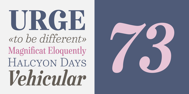  preview |
|
|
|
| Эти 7 пользователя(ей) сказали cпасибо за это полезное сообщение: |
|
16.11.2013, 20:17
|
#114
|
|
Постоялец
Пол:
Регистрация: 11.08.2009
Адрес: Каспийск
Сообщений: 357
Репутация: 2475
|
No. Seven 5 fonts: $42.25
 Designers: Emil Karl Bertell Design date: 2013 Publisher: Fenotype MyFonts debut: Oct 30, 2013 http://www.myfonts.com/fonts/fenotype/no.-seven/ __________________________________________________ ____________ Appleton $24.50  Design date: 2013 Publisher: Decade Typefoundry MyFonts debut: Oct 25, 2013 http://www.myfonts.com/fonts/decade-...ndry/appleton/
__________________
чем больше ты ждёшь- тем больше вероятность что ты ждёшь не там! 
|
|
|
|
| Эти 9 пользователя(ей) сказали cпасибо за это полезное сообщение: |
|
19.11.2013, 17:11
|
#115
|
|
Пользователь
Пол:
Регистрация: 12.11.2011
Сообщений: 152
Репутация: 1285
|
AT Katamaran
 http://www.myfonts.com/fonts/architaraz/at-katamaran/ Designers: Zhalgas Kassymkulov Design date: 2013 Publisher: Architaraz MyFonts debut: Sep 4, 2013 |
|
|
|
| Эти 7 пользователя(ей) сказали cпасибо за это полезное сообщение: |
|
20.11.2013, 16:26
|
#116
|
|
Пользователь
Пол:
Регистрация: 27.10.2013
Сообщений: 100
Репутация: 711
|
FF Quixo
Designer: Frank Grießhammer Design date: 2013 Publisher: FontFont https://www.fontfont.com/fonts/quixo  “Quixo” is an onomatopoeic exaggeration. If you are a good listener, you will know that the word comes directly from the sound of dipping a brush into a bottle of ink. It is also the sound of that same bottle, dropping on the floor: “Quix-O!!”. FF Quixo is a tool-based typeface family, based on the contrast of the pointed pen. Conceived from Frank Grießhammer’s graduation project at the Type and Media program at KABK Den Haag, the typeface is rooted in handwriting and explores the concept of increasing tool size in relation to weight. The visual influence of the tool is barely visible in the Regular weight, but more extreme in the Black one. The incorruptible result is a diverse spectrum of 12 styles (6 weights with Roman and Italic in each) suitable for compact and concise passages of text. FF Quixo plays on various sides of creative type – headline and text, bold and fine. It is a typeface that can show a playful side without looking goofy and is equipped with all the features and considerations necessary to produce complex typography. It feels at home whenever a touch of personality, whim, and symbols are required, but also provides the necessary precision for more functional applications. Packages available as 6 Weights at €219 or €49 per weight. |
|
|
|
| Эти 7 пользователя(ей) сказали cпасибо за это полезное сообщение: |
|
21.11.2013, 12:27
|
#117
|
|||||||||||||||||||
|
Постоялец
Пол:
Регистрация: 29.12.2008
Адрес: Michel Delving on the White Downs
Сообщений: 459
Репутация: 4985
|
 Velik About this font family
Designers: Mariya V. Pigoulevskaya Design date: 2013 Publisher: The Northern Block MyFonts debut: Nov 21, 2013
__________________
⁞ ★☭ Mad Max ☭★ ⁞
|
|||||||||||||||||||
|
|
|
| Эти 10 пользователя(ей) сказали cпасибо за это полезное сообщение: |
|
25.11.2013, 18:01
|
#118
|
|||||||||||||||||||
|
Постоялец
Пол:
Регистрация: 29.12.2008
Адрес: Michel Delving on the White Downs
Сообщений: 459
Репутация: 4985
|
 Core Mellow About this font family
Designers: Hyun-Seung Lee, Dae-Hoon Hahm, Min-Joo Ham Design date: 2013 Publisher: S-Core MyFonts debut: Nov 25, 2013
__________________
⁞ ★☭ Mad Max ☭★ ⁞
|
|||||||||||||||||||
|
|
|
| Эти 9 пользователя(ей) сказали cпасибо за это полезное сообщение: |
|
26.11.2013, 10:41
|
#119
|
|
Пользователь
Пол:
Регистрация: 27.10.2013
Сообщений: 100
Репутация: 711
|
Update to Euclid, Suisse and Release of NewParis
Euclid Flex | 10 styles: €375     NewParis | 4 packages, 21 styles: €300     Suisse | 5 packages, 45 styles: €500     Designers: Ian Party, Emmanuel Rey Design date: 2013 Publisher: Swiss Typefaces Последний раз редактировалось kobayashia; 26.11.2013 в 10:44.. Причина: prices |
|
|
|
| Эти 4 пользователя(ей) сказали cпасибо за это полезное сообщение: |
|
26.11.2013, 11:28
|
#120
|
|||||||||||||||||||
|
Постоялец
Пол:
Регистрация: 29.12.2008
Адрес: Michel Delving on the White Downs
Сообщений: 459
Репутация: 4985
|
 Trump Gothic Pro  | 6 OTF | Кириллица | About this font family
Designers: Patrick Griffin, Georg Trump, Stanislav Maršo Design date: 2013 Publisher: Canada Type MyFonts debut: Nov 26, 2013
__________________
⁞ ★☭ Mad Max ☭★ ⁞
Последний раз редактировалось NuttShell; 02.12.2013 в 18:31.. |
|||||||||||||||||||
|
|
|
|
 Похожие темы
|
||||
| Тема | Автор | Раздел | Ответов | Последнее сообщение |
| Славянские шрифты / Slavonic fonts | denisuis | Шрифты/Fonts | 121 | 25.07.2024 18:42 |
| Шрифты из игр / Game fonts | doctor ru | Шрифты/Fonts | 36 | 05.01.2024 07:00 |
| Шрифты / Fonts | arkad | Кисти для Photoshop / Brushes Photoshop | 30 | 10.01.2016 19:06 |
| Анимированные шрифты / Animated fonts | Rostocker | Шрифты/Fonts | 2 | 23.07.2014 16:10 |
|
|


 Линейный вид

